THE STARTING POINT
A logo, three colors and lots of very flat photos of stone. With that, we had to show that every piece is unique.
WHAT WE ACHIEVED
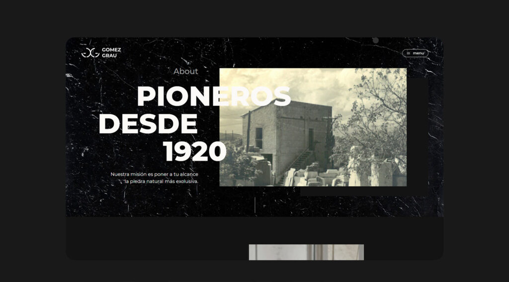
We expanded the brand without touching its foundation. With the logo and the three colors as a starting point, we defined an elegant, distinctive visual line for the website, closer to an architecture publication than to a materials catalog. The result is a website with a signature character, worthy of an audience of architects and interior designers who see a lot of material and can quickly tell the difference. On it, stone is presented as what it is: a unique piece for projects that want to stand out.
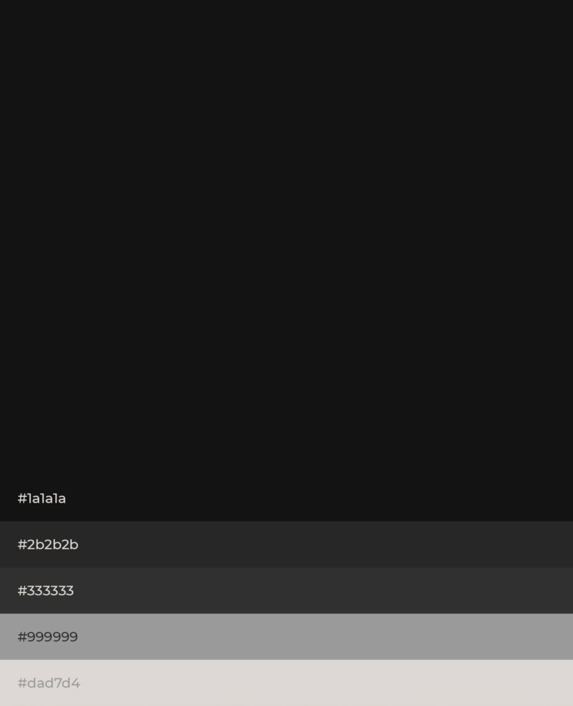
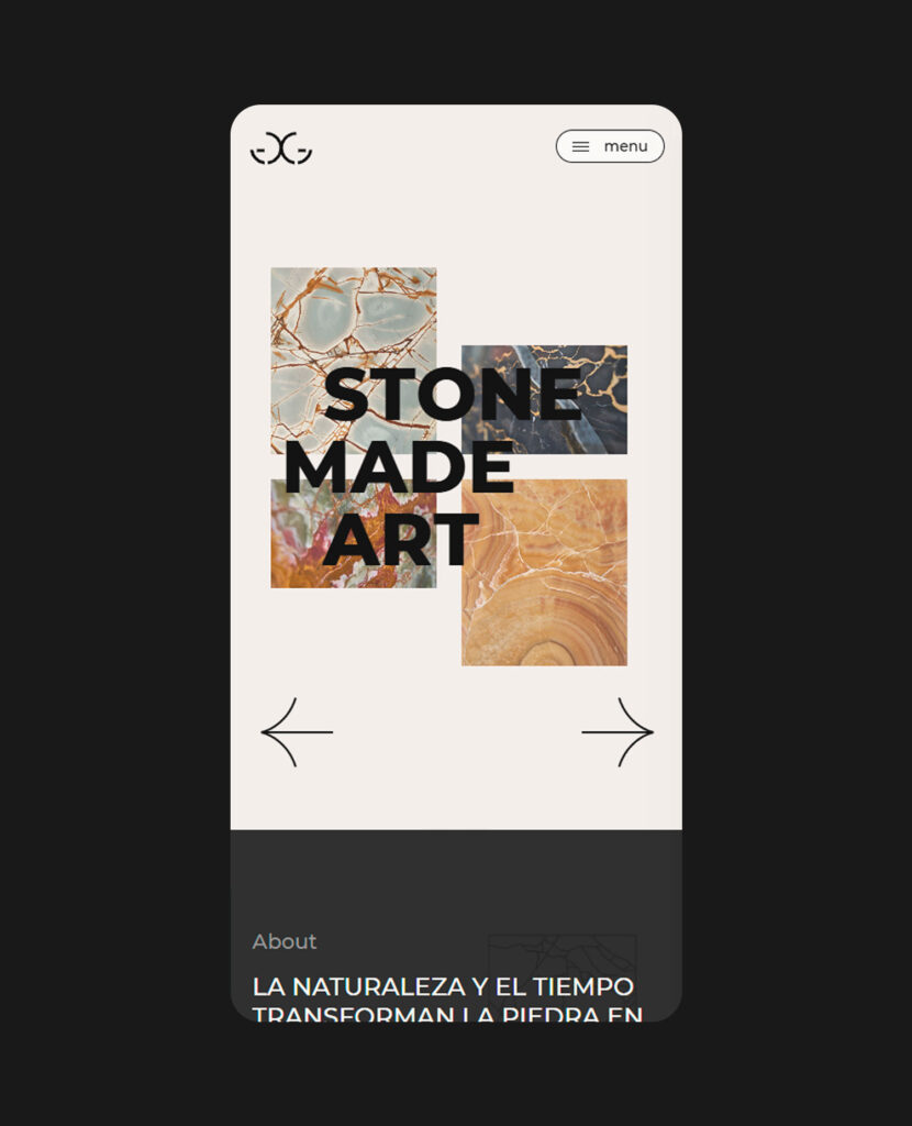
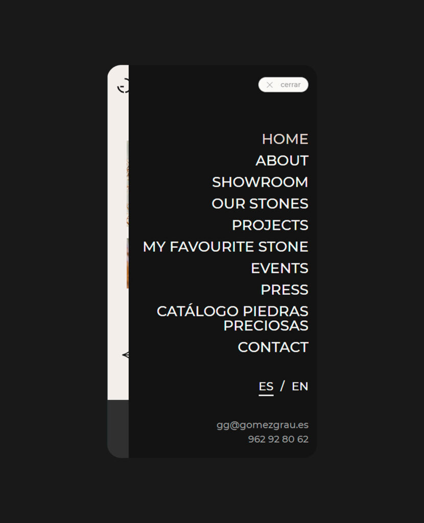
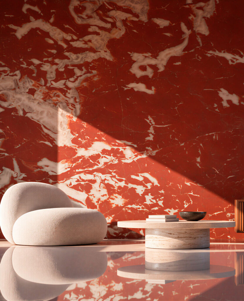
Where the photos fell flat, we built depth. Deconstructed structures that break the grid and textures that, by contrast, enhance the simplicity of the rest. Stone stops being a catalog photo and shows itself in all its nuance.
THE DETAIL
What moves gets looked at.
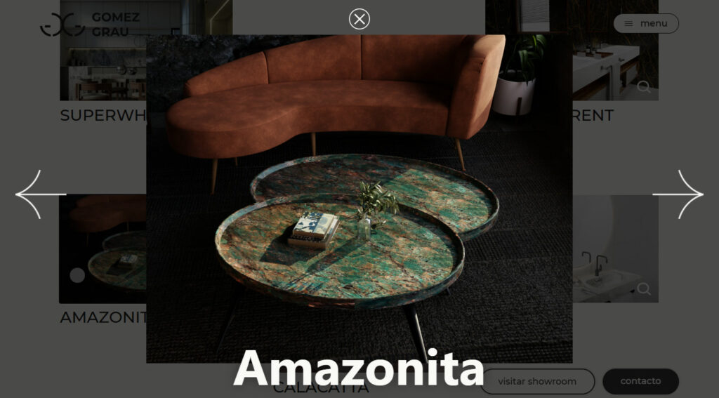
We chose few micro-animations and placed them where they add rhythm without stealing the spotlight from the material. A website made of still photography comes to life, invites you to explore it slowly and leaves the same feeling as a good stone: that of something cared for down to the last detail.
Does your product deserve more than a catalog? Tell us what you do and we’ll give it the stage it deserves.