THE STARTING POINT
A different kind of work, made by hand, that needed its own name without losing the family surname.
WHAT WE ACHIEVED
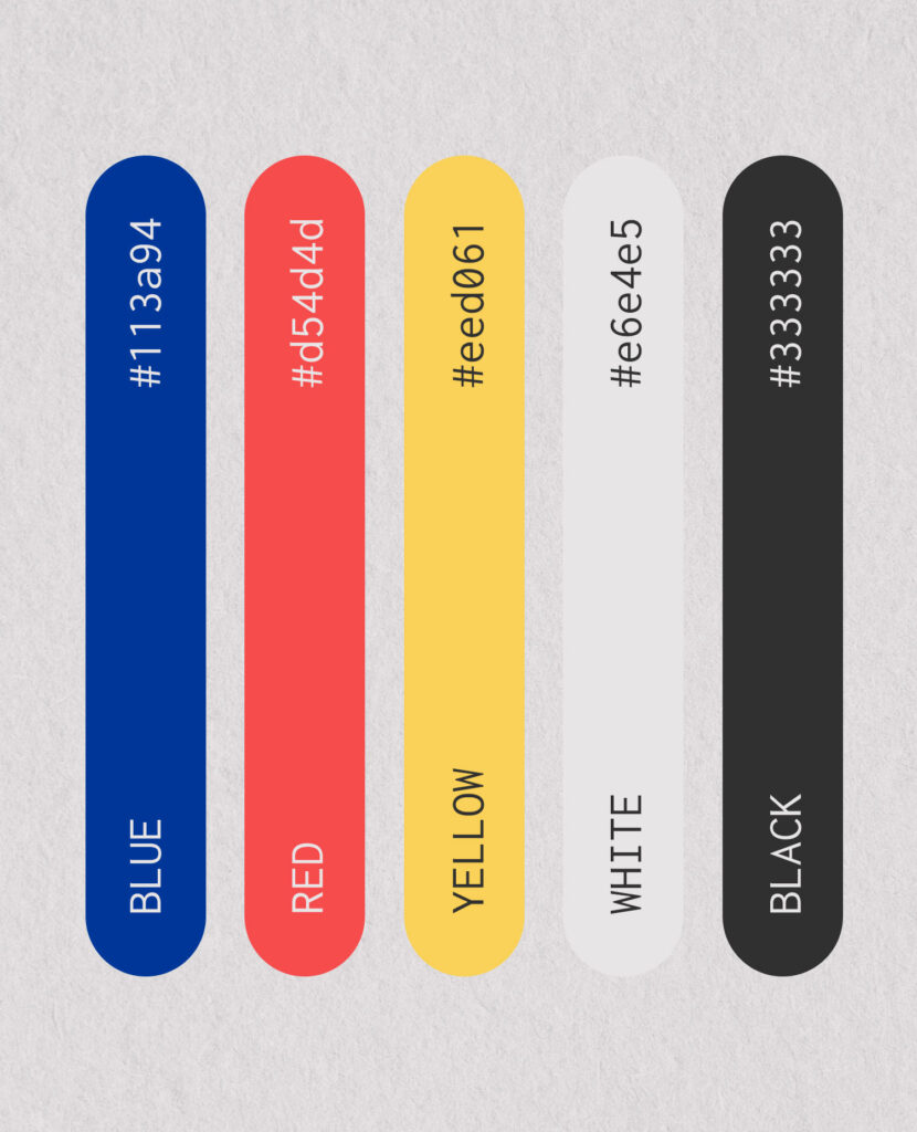
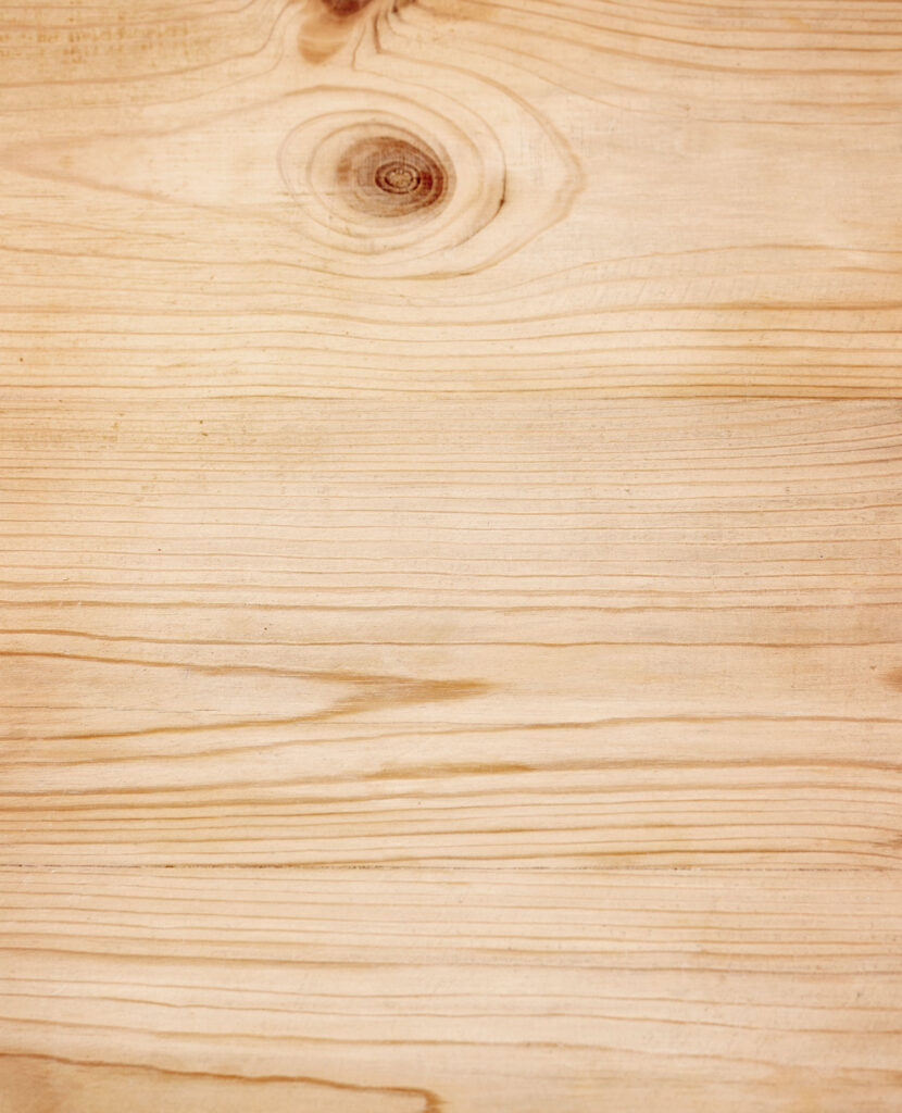
The name plays on the grain of the wood (“grano”) and on the “fino” it shares with Fresco&Fino: it sounds like a craft and is recognized as part of the family. From there we built a strong, bold identity: five colors (blue, red, yellow, white and black), a very heavy typeface and a simple logo that works just as well engraved in wood as on a screen. A brand designed to live alongside real materials.
THE MOVEMENT
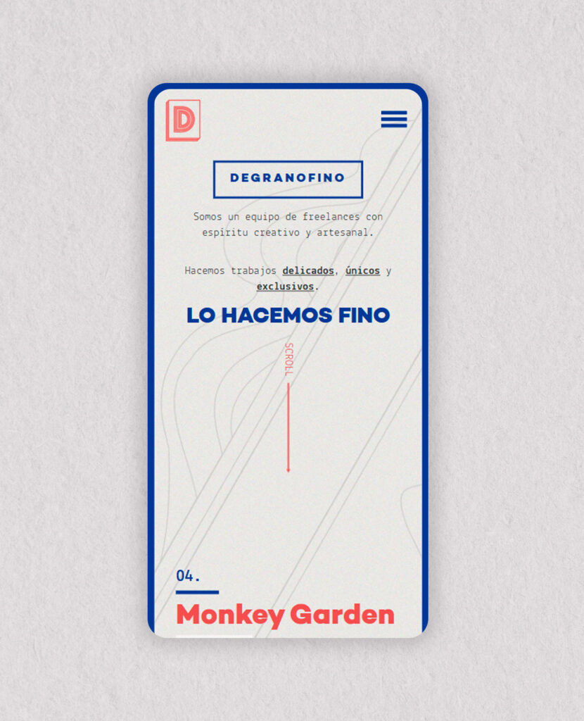
A website with the soul of a workshop.
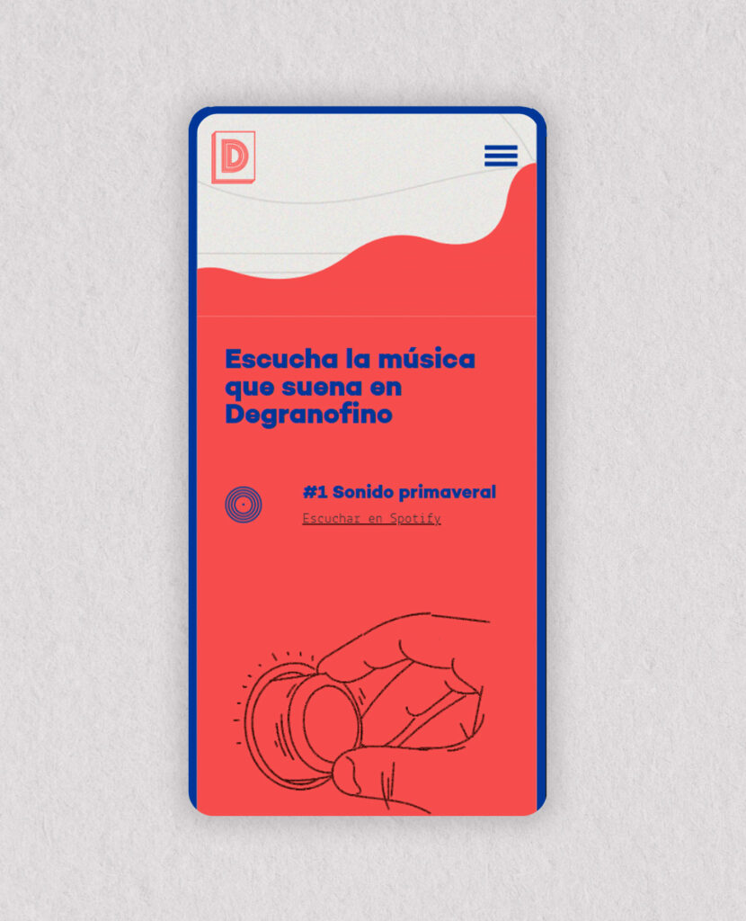
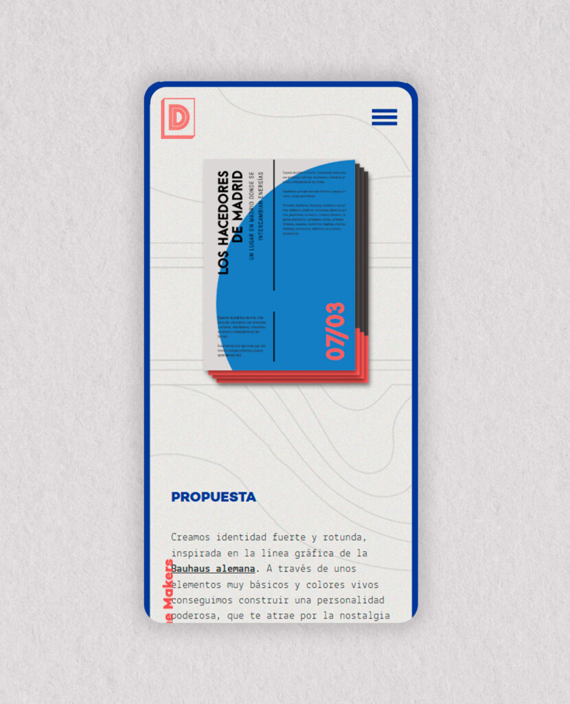
We designed and built a website that presents each project as a small story, with backgrounds reminiscent of paper, line illustrations and even a playlist with the music playing in the studio. You go through it the way you visit a workshop: slowly and noticing the details.
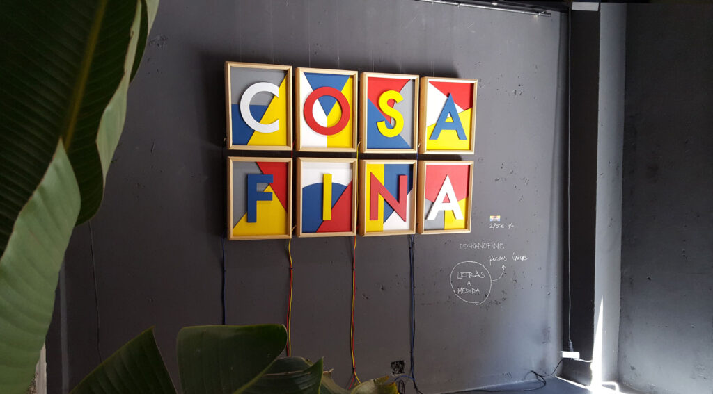
At Degranofino, art direction leaves the screen. The same colors and typeface live on illuminated wooden signs, labels, decorated spaces and hand-painted pieces. Every commission is different, but all are recognizable as part of the same house.
Is your project something you can touch? Tell us about it. We design it with the same care on paper, in wood or on screen.