THE STARTING POINT
A serious industry where everyone looks alike, and an idea that’s hard to fit on a phone: size.
WHAT WE ACHIEVED
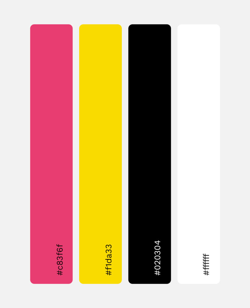
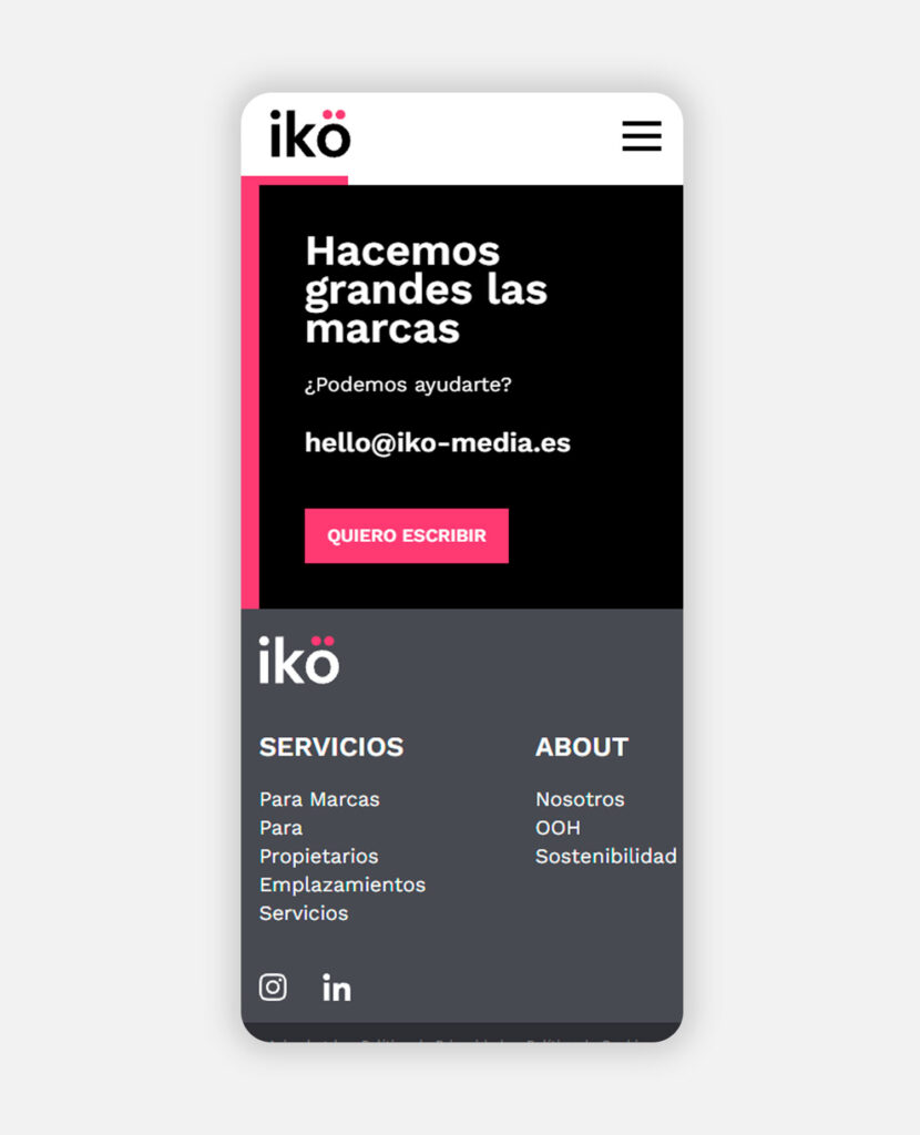
We created a modern, direct identity: white, black, magenta and yellow, a simple logo and basic structures. Hand-drawn graphics give it the human touch the industry usually lacks. We designed it for the web, but it worked so well that Ikö media has adopted it as its brand across all media.
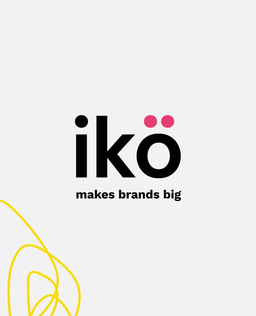
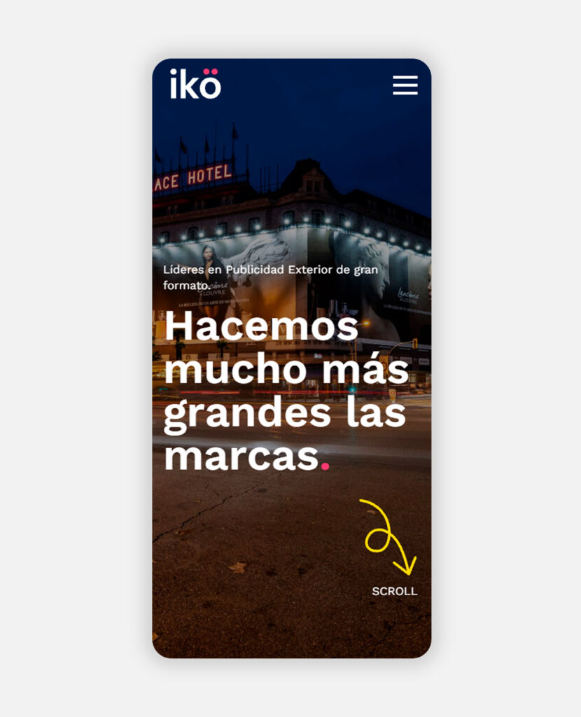
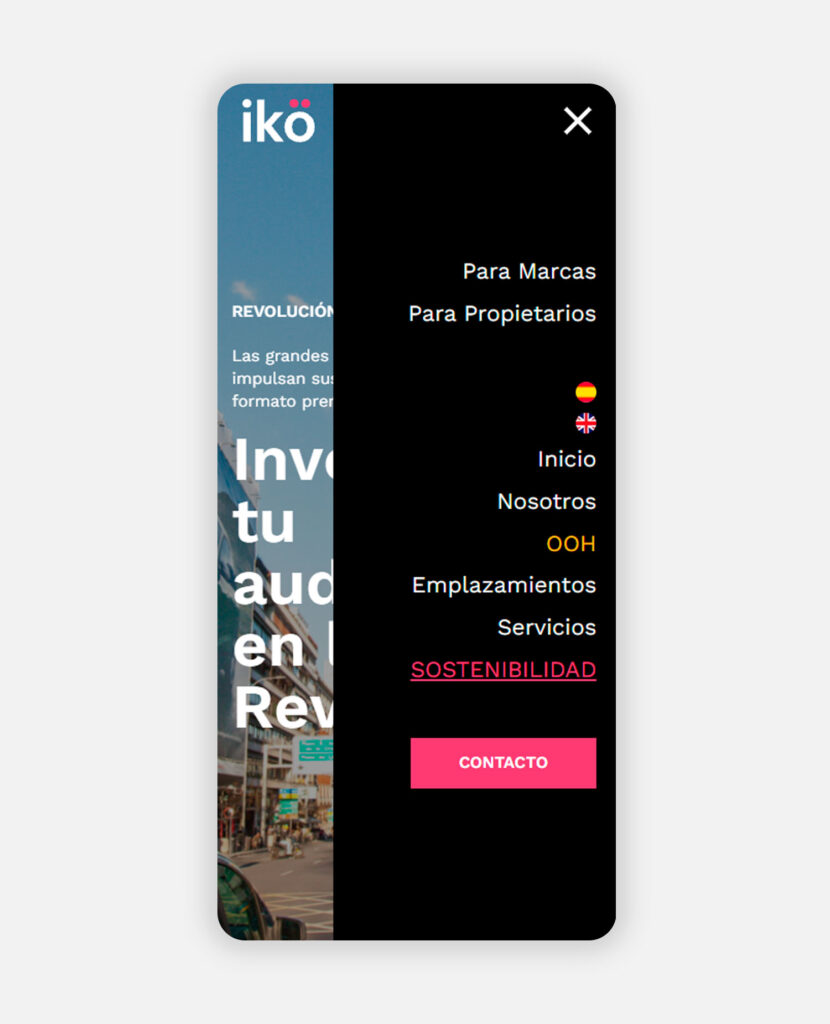
A brand doesn’t have to be gray to be professional. With two colors, hand-drawn strokes and a friendly tone, Ikö media tells what it does like no one else in its industry, on the website and in everything it signs. It’s an identity with a life of its own: its graphics draw themselves as you scroll down the page and accompany a story that’s a pleasure to read.
Does your brand look as big as it is? Tell us what you do and we’ll find a way to make sure it doesn’t go unnoticed.