THE STARTING POINT
Few sections and lots of detail. With so little, any imprecision shows.
WHAT WE ACHIEVED
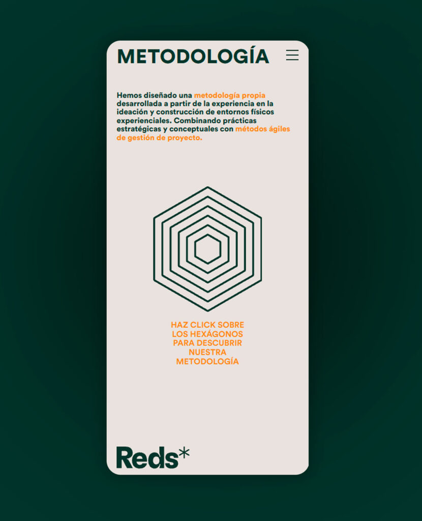
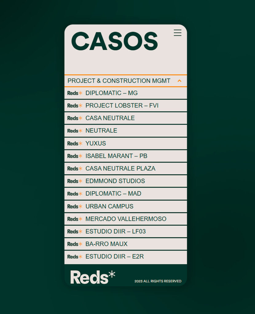
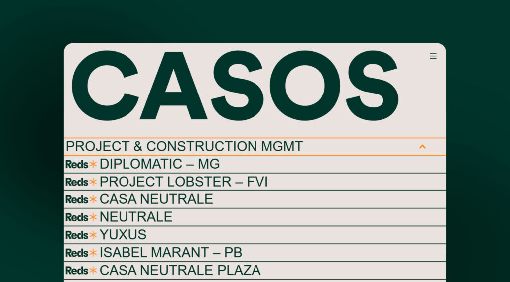
The website relied on what’s hardest to execute: very precise animations, highly detailed structures and plays of typography and image where a few pixels of difference change the result. We built each section to keep its character on mobile and desktop, with the same precision at every screen size. The result is a highly recognizable website made with very few elements.

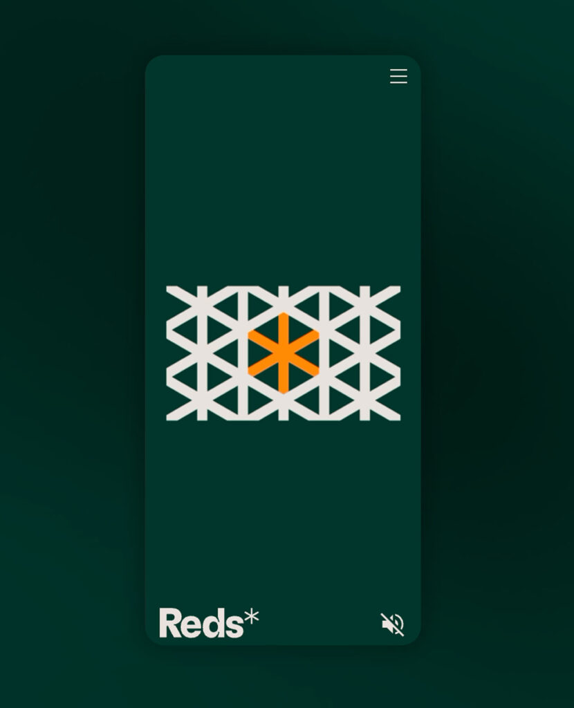
On the home page, video and animation blend until you can’t tell where one ends and the other begins. The eye perceives it as a single piece, and that first impression introduces the studio before the visitor reads a word.

THE MOVEMENT
No animation is decorative.
We fine-tuned the timing, paths and states of each animation so they support reading instead of interrupting it. There are few of them and each has a purpose: to draw the eye toward the studio’s work, which is what needs to be seen.
Is your website worthy of your work? Tell us what you have in mind and we’ll build it with the care it deserves.